It Matters Where You Seek COVID Data
Written for Bacon’s Rebellion By Steve Haner
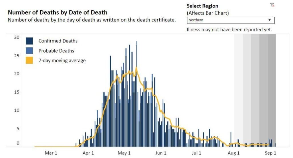
VDH chart of COVID-19 deaths over time in Virginia’s Northern Region, as of 9/5. Having been hit the worst early, it is now doing better than ROVA.
Even when there is no intent to twist the data, it still matters where you look if you want to see Virginia’s status in dealing with Our Permanent Pandemic.
The chart on the daily death count, for example, looks dramatically different on the Virginia Department of Health’s website when compared to the Virginia Public Access Project daily updates. It is clear example of how the same data can seem vastly different based on presentation.
What apparently is going on is that as VDH issues daily updates, the compilers at the health department account for each death on the date of actual death, which means 20 new reports on one day might be spread out back a week or more. At VPAP, the daily count is the daily count.
So, you get this chart below from VDH, as of Saturday. See the steady decline in deaths, and the huge difference from the early peak to the present day.
VDH chart of statewide deaths over time, as of 9/5.
The VPAP bar chart and seven day average show more peaks, and a would lead you to conclude Virginia is in more dire shape. It shows a seven day average death rate of about 15, almost three times the VDH chart’s seven day average below of below six. Fifteen versus six is a huge deal.
VPAP chart of Virginia deaths over time, as of 9/5.
VDH now has regional bar charts, as well, and some regions seem to be doing quite well. Both the Central Region (Richmond Metro) and the Northern Region (DC suburbs, chart at the top) have steadily maintained average death rates below one per day. It is still the case that more than half the deaths are in nursing homes and other congregate settings, so the risk outside those facilities may be lower still. (But not gone, folks, keep the guard up.)
VDH chart of daily deaths in Virginia’s Central Region (Richmond Metro) as of 9/5.
In those parts of Virginia, things look very much as they did three weeks ago, when last I mentioned things were improving.
Then there is the key metric of hospital admissions. VPAP is tracking the number of beds in use, but VDH is tracking the daily new admissions. Daily new admissions are steadily declining, now down to under 30 per day from a peak of 50 or so August 2. That’s the number to actually care about.
On the Joe Biden for President channels (CNN, MSNBC, MSM) the story of the weekend – in the continuing saga of “we’re all going to die thanks to Trump” – is about the coming wave of COVID-19 after we all behave stupidly over Labor Day. On the Donald Trump for President channel, mainly Fox News, it is getting less attention.
No question, there will be a surge of cases from the opening of the colleges as the students actually do behave stupidly in large numbers. JMU sending them all home was incredibly unhelpful. There will likely be more from Labor Day activities. The panic over K-12 school openings is off the chart – at “put Xanax in the water supply” levels.
But keep watching the hospital admissions as the first indicator of real trouble, and the best predictor of future morbidity. Watch them on the VDH’s web page. (And thank you, VDH, for continuing to improve utility of your reports.)


